
We give far too much credence to individual statistics on social and economic well-being. Take the poverty rate. That statistic tells us the share of the population below a specific income level but, alone, it can’t tell us how many people are clustered just below or above the line. And, like all estimates, it is imprecise.
Many people are probably vaguely familiar with the term “confidence interval” or “sampling error.” We regularly see these terms around election polling. They tell us that the numbers are not the Truth (capital “T”), they’re not certain, and they’re not 100 percent right.
Let’s get back to the poverty rate. The Census Bureau provides annual estimates of the poverty rate for each of the 3,142 counties and county equivalents in the United States. Each estimate is accompanied by a 90 percent confidence interval—a “lower bound” and an “upper bound”—that serve a similar purpose as the margin of sampling error numbers you see in the presidential polling numbers. In this case, the confidence interval says that if the Census Bureau were to collect 1,000 different samples of the population in each county, 900 of their poverty rate estimates would sit within the interval between the lower and upper bounds.
These confidence intervals are also related to the size of the county, because the larger the sample, the smaller the variation in different samples, and thus the more confident they (and we) can be about their estimates.
In other words, the 90 percent confidence interval for Crowley County, Colorado—with a population of 5,333 in 2013—ranges from a poverty rate of 33.2 percent to one of 53.2 percent, with the reported official rate as 43.2 percent (all three of which would generate a dark blue square in the southeast corner of Colorado in the maps above). By comparison, for larger counties like Los Angeles County, with a population of over 10 million in 2013, the confidence interval is much smaller, ranging from a poverty rate of 18.6 percent to 19.4 percent, with the best guess being 19.0 percent.
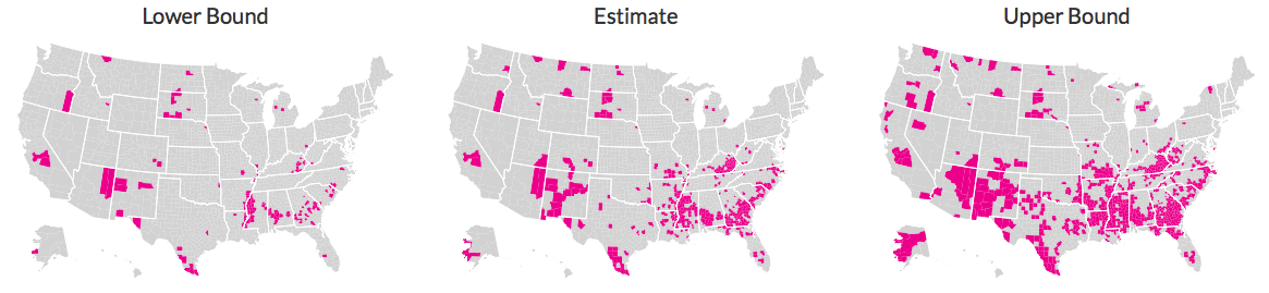
We’ve created these maps to help illustrate what uncertainty means and how it can affect patterns of poverty across the country. The map above on the left shows the official poverty rate in each county. You can see spots of high poverty in eastern Kentucky and southern West Virginia, across parts of the South, in South Dakota, and along the New Mexico–Arizona border.
But what do patterns in poverty look like when you use the Census Bureau’s confidence intervals? Once you press the “Play” button above the map on the right, the computer will randomly generate poverty rates for each county within each confidence interval, but not necessarily in the same direction. (Technically, the computer would more often randomly choose an estimate closer to the official poverty rate than the upper or lower bounds, but for this exercise, we were interested in the impact of estimates close to the edge of our confidence interval.) That means that, in some simulation, the poverty rate in Crowley County may be higher than its official rate, while the poverty rate in Los Angeles County is below the official number. You’ll still see many of those same, basic patterns, but at the local level, those poverty rates can differ by up to 10 percentage points.
A stylized example
This uncertainty can lead to differences in aggregate statements about poverty in the United States. For example, tabulating the official Census Bureau estimates, 369 counties have poverty rates at or above 25 percent (see the middle map below). If you took the extreme position and recreated the map using only the upper-bound estimates, an additional 365 counties would have poverty rates of at least 25 percent, for a total of 734 counties (the map on the right).
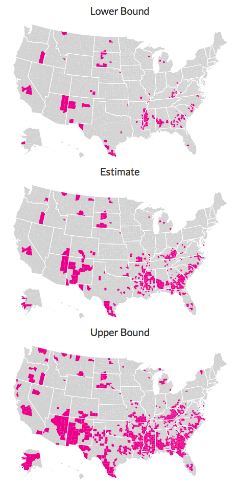
At the other end, if you looked at only the lower-bound poverty rate estimates, you would find only 133 counties for which the poverty rate is at least 25 percent (the map on the left).
Now, you would never really do this because both are extreme positions and we wouldn’t necessarily think that all of the Census Bureau’s estimates are off that far to one side or the other. Furthermore, claiming that the poverty rates are all at the lower bound or all at the upper bound would change the estimate of the national poverty rate. But what this stylized example shows is how confidence intervals might affect how we talk about poverty.
Uncertainty is part of the scientific process. As researchers at the Urban Institute, we are well aware of how crucial uncertainty can be in making estimates and, importantly, in commenting on or recommending policies. Not all research questions can be answered with full certainty, and even widely held beliefs can be challenged by new data and new evidence. To be aware of that uncertainty and how it can affect our conclusions about the economy and public policy are ongoing challenges.
Let’s help communities build more secure, hopeful futures.
Today’s complex challenges demand smarter solutions. Urban brings decades of expertise to understanding the forces shaping people’s lives and the systems that support them. With rigorous analysis and hands-on guidance, we help leaders across the country design, test, and scale solutions that build pathways for greater opportunity.
Your support makes this possible.