Not enough has been made about a recent American Enterprise Institute blog post by Charles Murray, who argues that “higher imprisonment was the necessary condition for 100 percent of the reduction in violent crime” over the past 20 years—a claim that runs counter to his colleagues’ assertions that the real correlation is far smaller. Here’s Murray’s graphic supporting that claim:
Murray's Original Graphic: Violent Offenses vs. Prisoners per 1,000 Violent Offenses
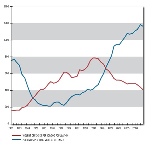
Murray’s analysis is a textbook example of how to mislead with statistics. First, let’s look at what happens if you focus exclusively on the blue line, which is the ratio of prisoners to violent crime. Murray wants you to interpret this as the change in the number of prisoners in America, arguing that the increase is evidence that the growing prison population has resulted in declining crime rates.
But that’s not at all what the blue line represents. Because it is the ratio of prisoners to violent crime, the blue line is the number of people we incarcerate per 1,000 violent crimes. Violent crime is tragic, but we, as a society, want that line to be as low as possible. The lower the line is, the less we are spending per violent crime. The line is at its minimum in the late 1970s until 1980—just prior to America’s incarceration binge. That the line goes up after 1980 is not a good thing, as Murray would have you believe, but a very bad thing—it’s what economists refer to as diminishing marginal returns to imprisonment. Every year since 1980 we have had to lock up a lot more people to maintain the same amount of violence, which means prison is getting less and less cost effective.
Prisoners per 1,000 Violent Offenses

And that’s just one problem with this analysis. A more troubling problem is that the data behind the graphic are inherently tautological. With some mathematical sleight of hand, Murray claims to compare prison and violence, when what he actually compares is violent offenses (the red line) to prisoners per violent offense (the blue line). In other words, Murray compares violence to violent crimes per prisoner. The comparison of the red line to the blue line is basically a ratio:
Violence: (Prisoner/Violence)
What’s wrong with that? This ratio has the convenient property of overstating the relationship between crime and the prison population. If violence declines, it affects both measures in a way that makes increases in imprisonment seem to be more important than they actually are. When violence declines, the blue line goes down, of course. But, since violence is the denominator of the red line, and a shrinking denominator makes a number bigger, the red line goes up by a similar proportion.
Since Murray essentially counts violence multiple times, this approach guarantees that his argument that prison reduces crime is supported by the graphic regardless of what actually happens with imprisonment and violence.
Moving from left to right on Murray’s graphic, we start with 1960–1971 when violence increased about 250 percent and prison populations declined ever so slightly (from 212,000 to 198,000 or 6.6 percent). Thus, of course, the red line increases about 250 percent. What happens to the number Murray wants you to see as the “prison” statistic? In real terms, prison populations declined 6.6 percent, so the blue line should be almost flat. But, since violent offenses are on both sides of the equation, the red line declines more than 300 percent. Magic! The huge decline in the blue line visually supports Murray’s contention that declining incarceration causes more crime in the same way increasing incarceration causes less crime. But, of course, it is an illusion since the number of prisoners was basically flat.
Taking this analytic approach makes it very easy to disguise the real relationship between imprisonment and violent crime. Here’s a simple thought experiment to demonstrate that changes in violence, and not changes in prison populations, explain Murray’s entire story: suppose we take the real crime trend as depicted above and graph it. Then let’s assume that the prison population had remained unchanged. Here’s that picture:
Per Capita Violence Compared to a Static Prison Population

It looks almost exactly like Murray’s graphic. Why is that? Because Murray’s graphic is not really about the effect of imprisonment on crime at all. Instead, it’s just about changes in violence.
Want more evidence? Here’s a straight up comparison of the number of prisoners (per 100,000 Americans) and violent offenses (per 100,000 Americans). It’s far less convincing than Murray’s graphic.
The True Relationship: Changes in Crime vs. Changes in Prisoner Levels
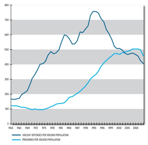
While it is likely that prison had some effect on the crime decline, the picture Murray relies on dramatically overstates the effect.
Tune in and subscribe today.
The Urban Institute podcast, Evidence in Action, inspires changemakers to lead with evidence and act with equity. Cohosted by Urban President Sarah Rosen Wartell and Executive Vice President Kimberlyn Leary, every episode features in-depth discussions with experts and leaders on topics ranging from how to advance equity, to designing innovative solutions that achieve community impact, to what it means to practice evidence-based leadership.